DESIGN CONCEPTS / WEBNERIVO

Examples of structure and visual direction. Design concepts.

Four independent design concepts explore the presentation of property, automotive services, products and a restaurant menu. They are studio studies, not client commissions or proof of working services.

CONCEPT STUDIES

Independent Studio Exploration

01 / PROPERTY DESIGN CONCEPT

NORD Residence

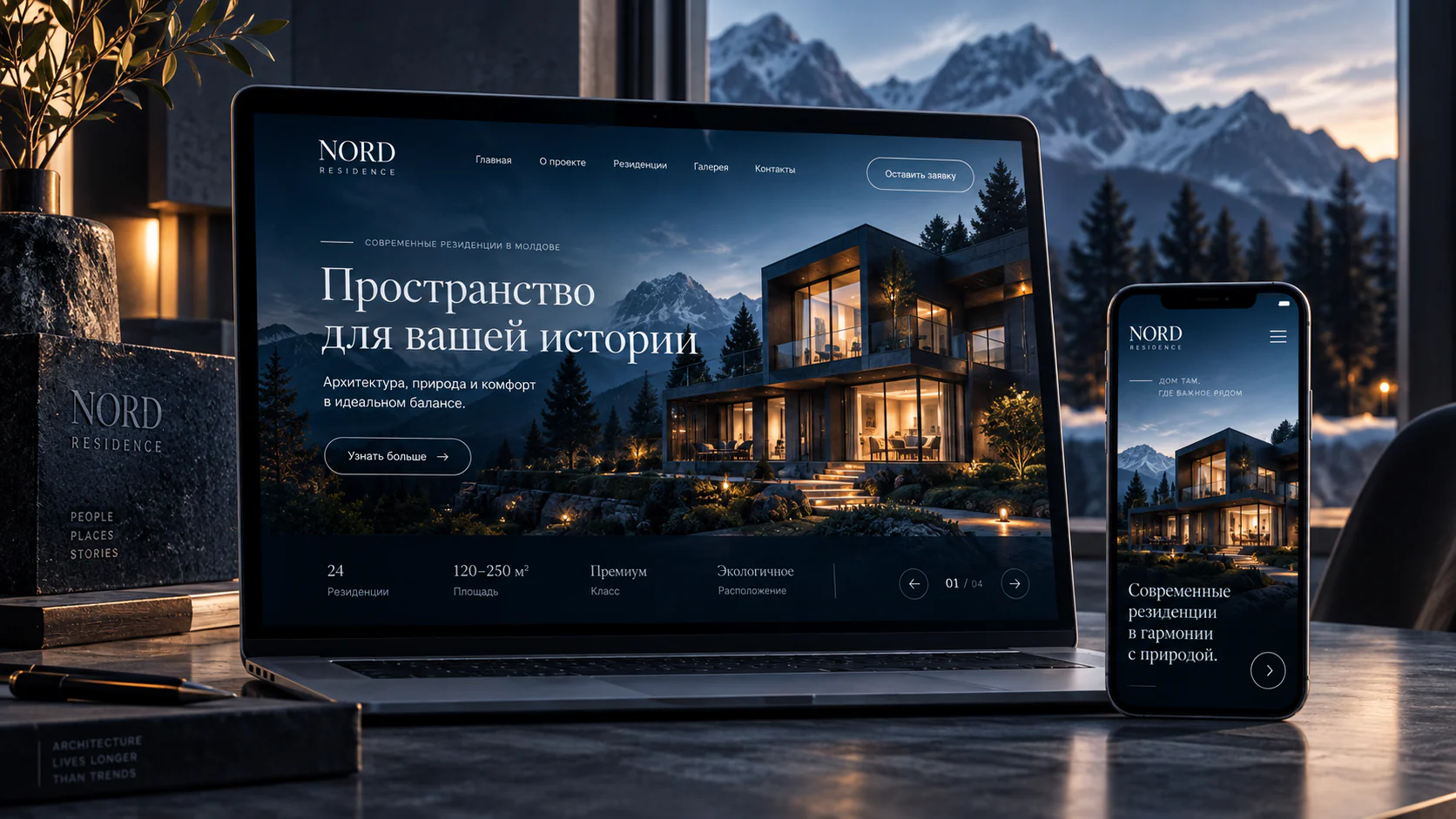
NORD Residence explores the presentation of one housing project: architectural images, layout information and a route to ask a representative a question. The name belongs to the concept, not a confirmed client.

  • An architectural introduction
  • Layouts and key project details
  • A clear place to make an enquiry
Discuss a residential project website
NORD Residence — property website design concept

Crops of the same existing image. A visual demonstration, not a working client website.

An independent studio exploration. Interface features are presented as design ideas, not as claims about a working product.

The concept brief
Present a residential development in a sequence that lets people explore the property and understand what to ask next.
Who it is for
People considering a home, balancing an impression of the architecture with practical project information.
Information structure
A first impression → architecture and setting → layouts → an enquiry point.
Visual decisions
Large architectural images, a restrained palette and clear typographic hierarchy create a calm reading experience.
Mobile direction
The mobile direction uses a single reading sequence, generous imagery and a visible way to reach contact.
From a visual idea to a useful journey

Demonstration concept. These are development proposals; the image does not establish working forms, payments or integrations.

Proposed visitor journey
Move from the opening screen to the project information, compare available floor plans and ask a representative a specific question. Real availability and property details would require confirmed data.
Possible features
Floor-plan filters and viewing enquiries could be added. CRM connections and availability updates need separate agreement; the mockup is not a catalogue of real properties.
What to check on mobile
Check readable specifications, floor-plan selection without zooming and a short route to contact. The image already includes a distinct mobile presentation.
A business website for a property project ↗

02 / AUTOMOTIVE DESIGN CONCEPT

VOLT Garage

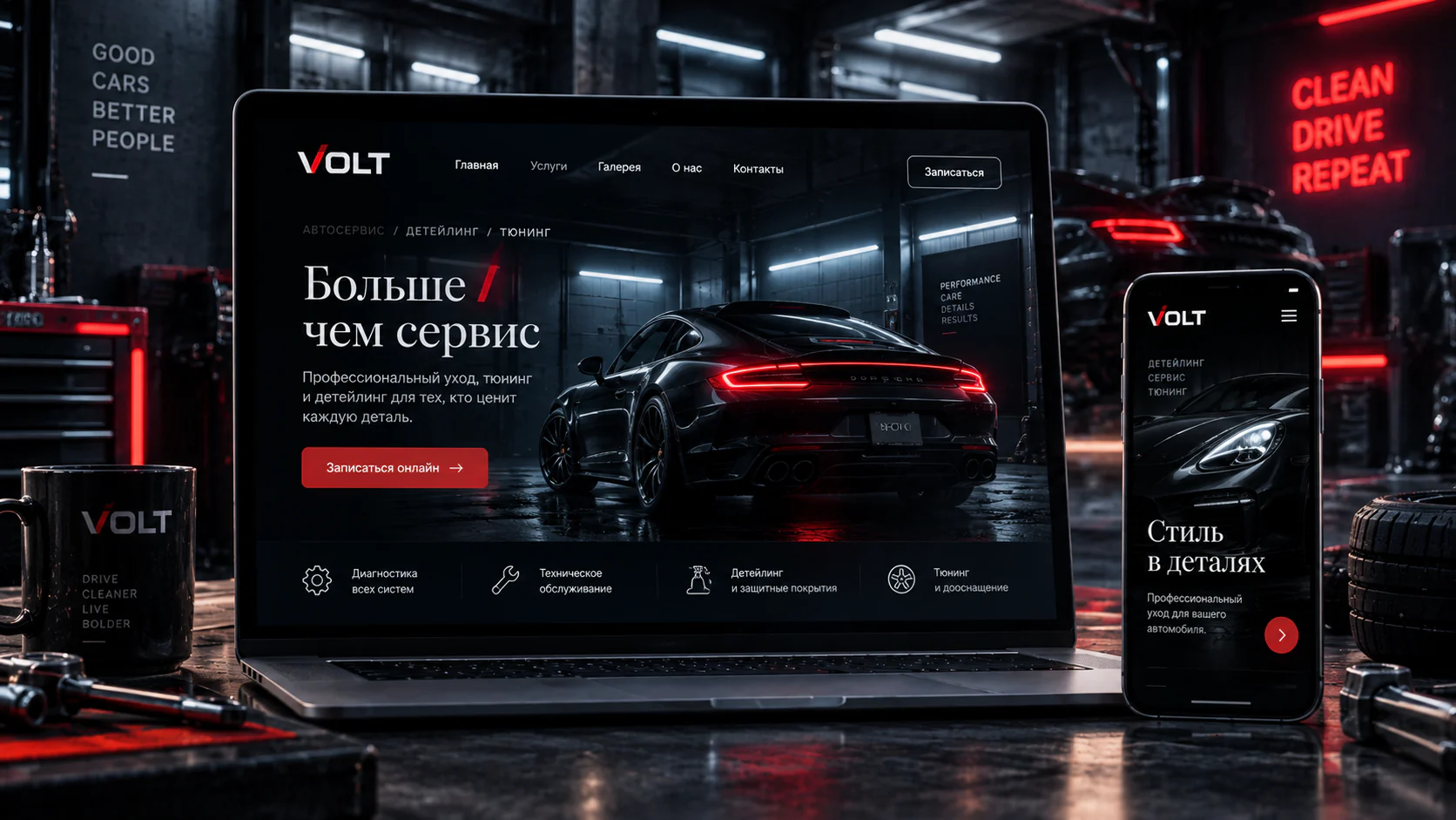
VOLT Garage shows a possible grouping of workshop and detailing services with a contact route. Its dark palette and automotive imagery illustrate a visual direction, rather than results for a real business.

  • Clear service categories
  • A route from browsing to enquiry
  • An automotive visual identity
Discuss an auto repair website
VOLT Garage — workshop website design concept

Crops of the same existing image. A visual demonstration, not a working client website.

An independent studio exploration. Interface features are presented as design ideas, not as claims about a working product.

The concept brief
Express the character of an automotive workshop and help visitors identify the relevant service before getting in touch.
Who it is for
Car owners looking for a clear picture of the workshop’s specialisms and contact options.
Information structure
Brand introduction → service directions → supporting visuals → contact.
Visual decisions
A dark, contrasting palette and strong automotive imagery establish the tone; clear labels organise the offer.
Mobile direction
The mobile direction brings services into one column with readable headings and practical contact targets.
From a visual idea to a useful journey

Demonstration concept. These are development proposals; the image does not establish working forms, payments or integrations.

Proposed visitor journey
Choose diagnostics, maintenance or detailing, then describe the vehicle before speaking to staff. Red accents highlight the enquiry action, while service groups support the choice.
Possible features
Options include a make-and-model form, a preferred-time request and staff notifications. Automatic appointments need a maintained schedule and a separate connection.
What to check on mobile
Check the route from a service to calling or completing a form, long model names and validation errors. The illustrated mobile screen shows composition, not a tested working system.

A landing page for an automotive service ↗

03 / E-COMMERCE DESIGN CONCEPT

MIRA

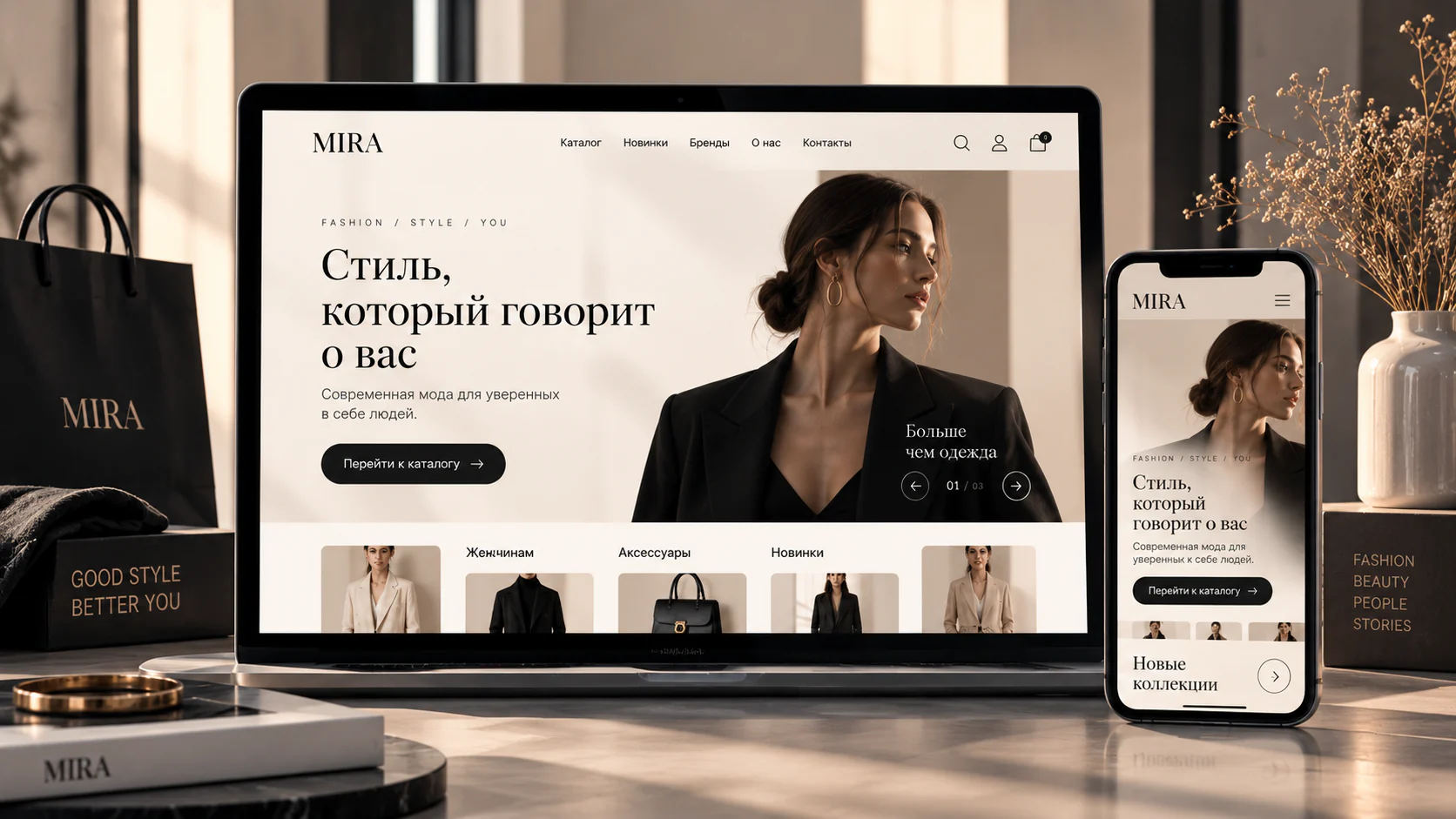
MIRA explores catalogue presentation: categories, imagery and comparable product information. It supports a discussion about displaying a range; it does not establish working basket, payment or stock functions.

  • Catalogue and category structure
  • Product page ideas
  • Presenting product choices
Discuss an ecommerce website
MIRA — e-commerce website design concept

Crops of the same existing image. A visual demonstration, not a working client website.

From a visual idea to a useful journey

Demonstration concept. These are development proposals; the image does not establish working forms, payments or integrations.

Audience and purpose
A fashion and accessories catalogue concept for shoppers who begin with imagery and then compare products. Its purpose is to connect brand presentation with a useful category choice.
Possible structure
Featured collection → categories → product list → product details → basket and checkout as potential development.
Visual approach
A warm light palette, prominent fashion photography and a contrasting dark catalogue button. White space separates the offer from product categories.
Proposed visitor journey
Move from a collection to a category, select a product and check size and colour. Availability, payment and fulfilment belong to a future working store.
Possible features
Size filters, variants, basket and notifications could be agreed. Stock data, payment processing and administration require their own inputs and testing.
What to check on mobile
The illustrated mobile layout retains the image and catalogue action. Filters, product details and checkout with the keyboard open would need separate implementation checks.

Ecommerce website development ↗

A small catalogue interface example

Switch category and product variant. This demo shows navigation and card updates; it does not process purchases or submit data.

Shirt

Example: light variant

Bag

Example: light variant

04 / HOSPITALITY DESIGN CONCEPT

Casa Verde

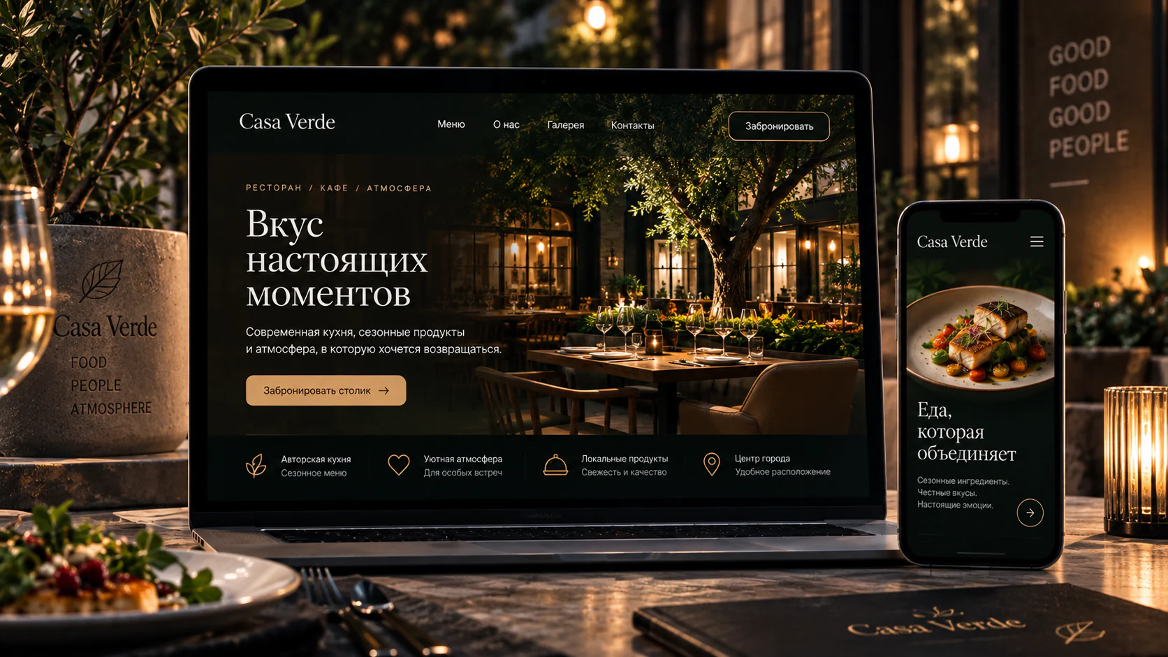
Casa Verde combines atmospheric imagery, menu sections and the idea of a table enquiry. It proposes a restaurant website structure, rather than a working booking system.

  • Menu sections
  • A table-enquiry idea
  • Local contact information
Discuss a restaurant website
Casa Verde — restaurant website design concept

Crops of the same existing image. A visual demonstration, not a working client website.

From a visual idea to a useful journey

Demonstration concept. These are development proposals; the image does not establish working forms, payments or integrations.

Audience and purpose
A restaurant concept for guests choosing a venue by food, atmosphere and convenience. Its purpose is a clear route from the first impression to the menu and contact.
Possible structure
Venue introduction → menu → atmosphere and gallery → location, opening hours and a table enquiry.
Visual approach
A dark green background, warm gold accents, interior and food photography. A contrasting button gives the next step priority over competing actions.
Proposed visitor journey
Read the menu, check the location and time, then request a visit. Table confirmation must follow the venue’s actual operating process.
Possible features
An editable menu, location selector and reservation enquiry are possible. Live table availability and online ordering need separate agreement; a drawn button does not provide them.
What to check on mobile
Food becomes the main visual focus in the mobile illustration. In development, menus should be readable without zooming a PDF, with calling and directions still easy to find.

A venue website and menu ↗

Facebook